Single Post
CSSで作るフラットデザインボタン
| Web
CSS3の登場によってオシャレなフラットデザインボタンを簡単に作れるようになりましたね。ここでは、簡単に作れるボタンをソースと一緒に紹介していきたいと思います。気に入ったボタンがあれば、ソースごとコピーペーストで使ってみてくださいね。
追記【2015年11月5日】:このページにアクセスが多くのアクセスを頂いたので、新しいボタンを制作して掲載しております。下記リンクより閲覧ください!!
追記【2017年3月15日】:Font Awesome Iconsのアイコンフォントにアニメーションを加えるスキルを友人から教えて貰いました。下のボタンにマウスオーバーして頂くとiconがアニメーションします。方法は、ボタンをクリックして頂き詳細ページでご確認ください。
ボタンは、「large」「midium」「small」を用意しました。HTMLは、以下の通りです。
       <div class="mb-10">
            <a href="#" class="btn btn-mod btn-border btn-large btn-round">Button</a>
        </div>

        <div class="mb-10">
            <a href="#" class="btn btn-mod btn-border btn-medium btn-round">Button</a>
        </div>

        <div class="mb-10">
            <a href="#" class="btn btn-mod btn-border btn-small btn-round">Button</a>
        </div>


        <div class="mb-10">
            <a href="#" class="btn btn-mod btn-border btn-circle btn-large">Button</a>
        </div>

        <div class="mb-10">
             <a href="#" class="btn btn-mod btn-border btn-circle btn-medium">Button</a>
        </div>

        <div class="mb-10">
             <a href="#" class="btn btn-mod btn-border btn-circle btn-small">Button</a>
        </div>
CSSは以下の様に記載します。
.mb-10{
    margin-bottom:30px;

}

.btn-mod,
a.btn-mod{
    -webkit-box-sizing: border-box;
	-moz-box-sizing: border-box;
	box-sizing: border-box;
	padding: 4px 13px;
  	color: #fff;
  	background: rgba(34,34,34, .9);
	border: 2px solid transparent;
	font-size: 11px;
	font-weight: 400;
	text-transform: uppercase;
	text-decoration: none;
	letter-spacing: 2px;

	-webkit-border-radius: 0;
	-moz-border-radius: 0;
	border-radius: 0;

	-webkit-transition: all 0.2s cubic-bezier(0.000, 0.000, 0.580, 1.000);
    -moz-transition: all 0.2s cubic-bezier(0.000, 0.000, 0.580, 1.000);
    -o-transition: all 0.2s cubic-bezier(0.000, 0.000, 0.580, 1.000);
    -ms-transition: all 0.2s cubic-bezier(0.000, 0.000, 0.580, 1.000);
    transition: all 0.2s cubic-bezier(0.000, 0.000, 0.580, 1.000);
}
.btn-mod:hover,
.btn-mod:focus,
a.btn-mod:hover,
a.btn-mod:focus{
	font-weight: 400;
	color: rgba(255,255,255, .85);
  	background: rgba(0,0,0, .7);
	text-decoration: none;
    outline: none;
}
.btn-mod:active{
	cursor: pointer !important;
}
/* ==============================
   ボタンサイズ
   ============================== */
.btn-mod.btn-small{
  	padding: 6px 17px;
	font-size: 11px;
    letter-spacing: 1px;
}
.btn-mod.btn-medium{
  	padding: 8px 37px;
	font-size: 12px;
}
.btn-mod.btn-large{
  	padding: 12px 45px;
	font-size: 13px;
}
/* ==============================
   border黒枠ボタン
   ============================== */
.btn-mod.btn-border{
  	color: #151515;
	border: 2px solid #151515;
  	background: transparent;
}
.btn-mod.btn-border:hover,
.btn-mod.btn-border:focus{
  	color: #fff;
	border-color: transparent;
  	background: #000;
}
/* ==============================
   角丸ボタン
   ============================== */
.btn-mod.btn-circle{
	-webkit-border-radius: 30px;
	-moz-border-radius: 30px;
	border-radius: 30px;
}
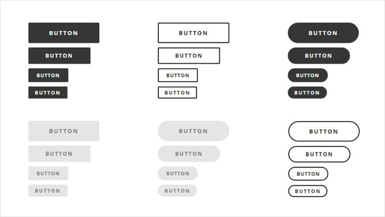
下記の様な感じのボタンが出来上がったと思います。