Single Post
gridで作るフルスクリーン画像
| Column

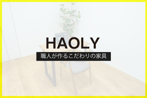
以前フルスクリーン画像をブログで投稿したことがあるのですが、今回はgridレイアウトを使ってレスポンシブル対応のフルスクリーン画像を制作してみました。更に画像の上にボックスを重ねてテキストを画像の上に掲載できるようにしています。
HTML
<section class="contens_full">
   <div class="photo">
     <img src="images/example.jpg" alt="イメージ">
   </div>
   <div class="text">
     <p>この文章はダミーです。文字の大きさ、量、字間、行間等を確認するために入れています。この文章はダミーです。文字の大きさ、量、字間、行間等を確認するために入れています。</p>
   </div>

 </section>
.contens_full {
  display: grid;
  grid-template-columns: 1fr;
  justify-content: center;
  align-content: center;
  height: 100vh;
  position: relative;
}

.photo {
  position: absolute;
  top: 0;
  left: 0;
  width: 100%;
  height: 100%;
  overflow: hidden;
}

.photo img {
  position: absolute;
  top: 50%;
  left: 50%;
  transform: translate(-50%, -50%);
  min-height: 100%;
  min-width: 100%;
  max-width: none;
}

.text {
  position: absolute;
  top: 50%;
  left: 50%;
  transform: translate(-50%, -50%);
  text-align: center;
  padding: 20px;
  max-width: 80%;
  margin: auto;
  background-color: rgba(255, 255, 255, 0.5);
  backdrop-filter: blur(5px);
}

.text p {
  text-align: left;
}